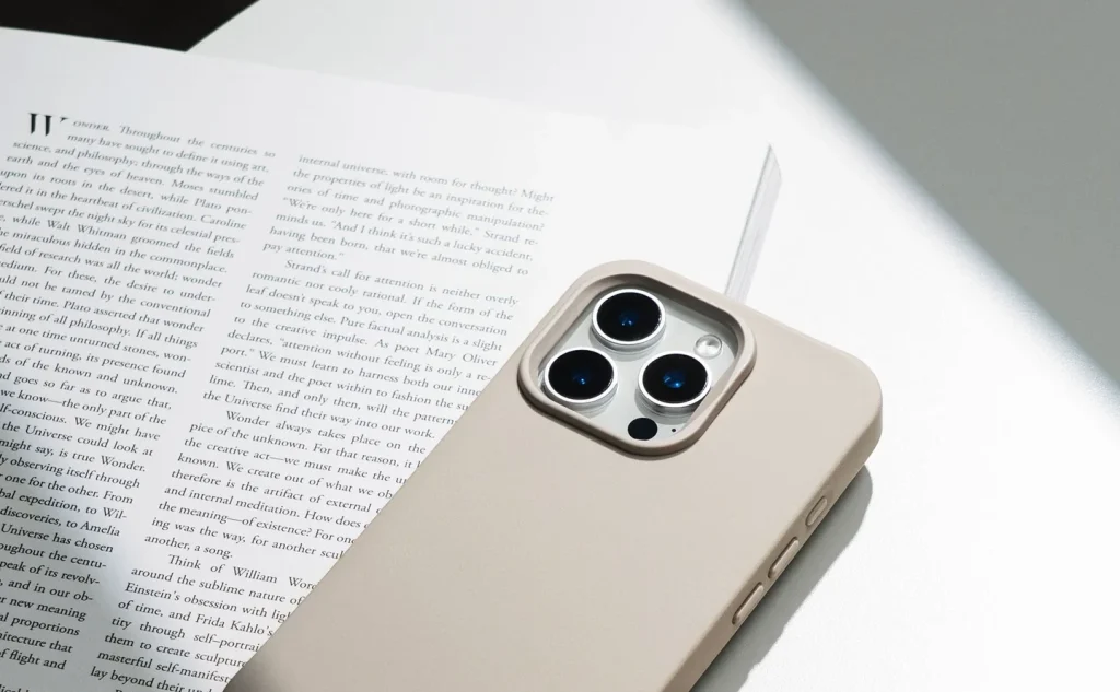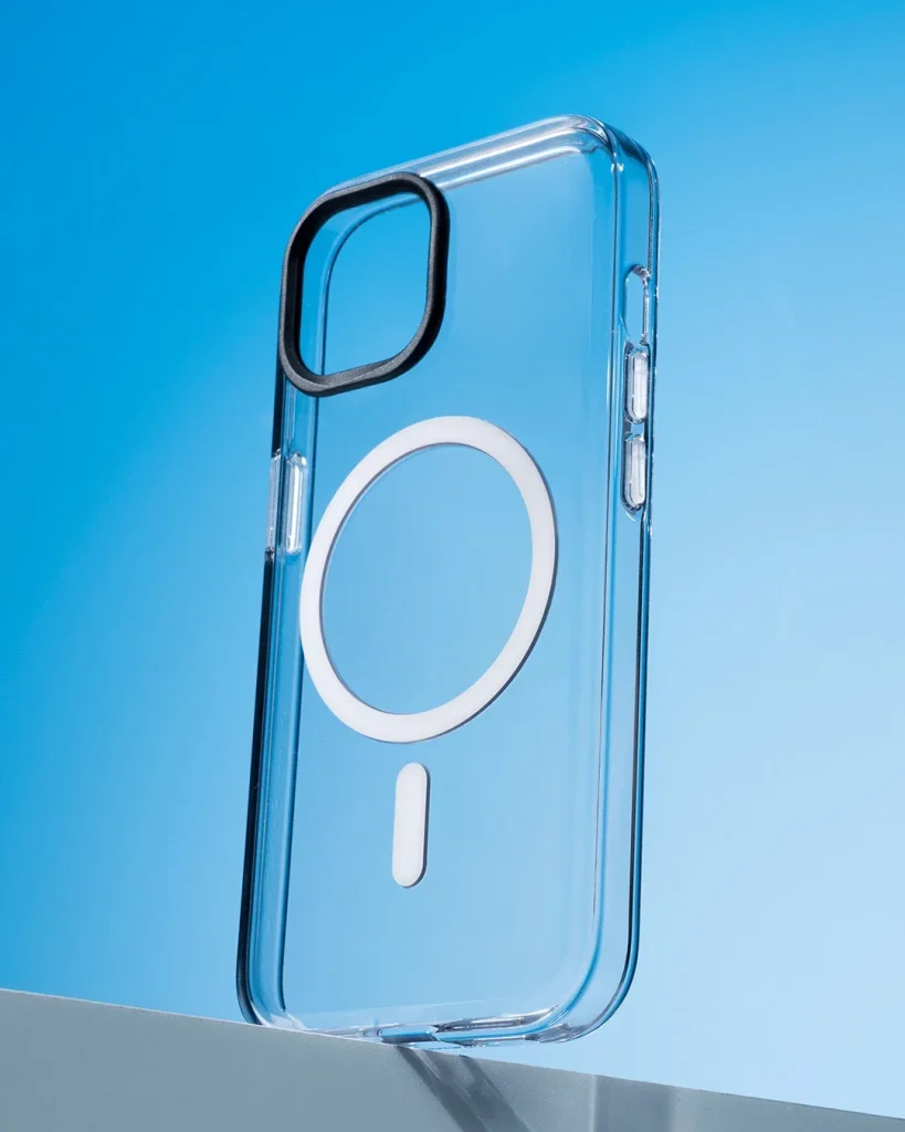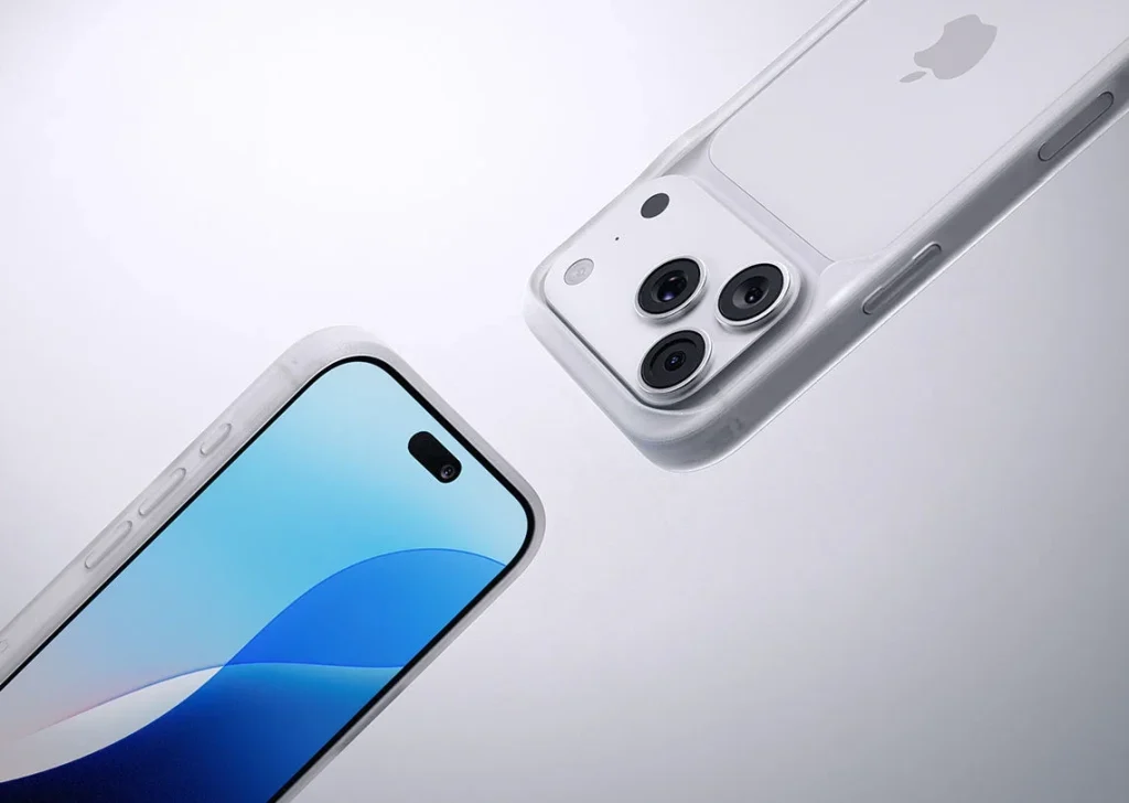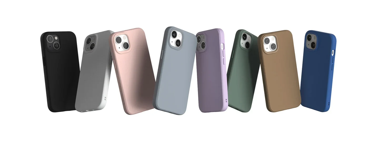
Use the assembled phone
Where possible, compare a case fitted to your phone colour. Translucent panels, open camera areas and edges let the device colour influence the result. A small screen swatch can also differ from the real surface, so treat it as an indication rather than a precise match.
Compare two kinds of light
Look near a window and under the indoor light you use most. A muted shade may look warmer or cooler between the two. Hold the case beside a familiar neutral object and compare one option at a time instead of relying on a brightly lit product photograph.
Notice the finish as well
A glossy blue, a textured blue and a matte blue can read very differently. Reflections may emphasise fingerprints, while texture changes the feel against a pocket. Choose the surface for handling and cleaning as well as the colour it shows on the desk.
Try one clear connection
Match a strap, bag detail or clothing accent if you want a linked palette. Exact matching is optional; a repeated lightness or muted tone can also work. Check the combination in the same light, since separate product images rarely provide a reliable colour comparison.
Think about contact marks
Light surfaces can show pocket dye or makeup, and dark surfaces can make pale dust obvious. Read the cleaning directions before choosing a finish for a busy routine. Avoid leaving a case pressed against damp dyed fabric, and treat new marks gently with an approved method.
Keep function in the choice
Compare the same fit and construction where possible so colour does not distract from the device openings or grip. Check button visibility and whether you can find the phone in your bag. A favourite shade is more useful when the case also suits the way you carry it.
Consider the details. Carry what works for you.